Thursday, 18 March 2010
Spring is sprung!
Just dropping by to show you a little illustration I've done for the cover of the Pulse publication I do for the IISP. It's all about green shoots and hope and such - and incorporates the arrow of the IISP logo into the design. Brush work in Indian ink, scanned in and then manipulated in Photoshop, much like the Welsh Music Foundation poster here.


Tuesday, 16 March 2010
The Ten Commandments of working with Graphic Designers
1 Thou shalt present thy graphic designer with a well-thought-out brief, considering target audience, likes and dislikes, brand guidelines if relevant, photography & illustration commissioning budget, amount of text and schedule. Thou shalt have this sorted before requesting a quote. Thou shalt present the same brief to all the designers from whom thou art requesting a quote, so that thou art comparing apples with apples and not oranges.
2 Thou shalt consider all the time, thought, hard work, expensive hardware and software, training, skills and creativity involved in the commission before whinging about said quote, sayingst things such as 'my nephew said he couldst design it in MS Paint for twenty quid'.
3 Thou shalt not supply photographs or graphics in Word, Powerpoint or any other Microsoft package. Thy designer has the right to the soul of thy first-born child if this Commandment be broken.
4 Thou shall supply high-quality, high-resolution images if thou requirest that thy publication not look like the dinner of a dog. Heed thy designer's advice on this, for verily, s/he is learn'd. Be prepar'd to pay for such venerable things from istock and such like for they are not that expensive really when thou thinkest about it.
5 Thou shalt NEVER request that thy designer use the typeface known as Comic Sans, for it is the work of Satan.
6 Thou shalt not ask for work to be done for free, on the off-chance that thy bizarre business idea takes off and thou becomest a millionaire.
7 Thou shalt appreciate that now and again thy designer might declare a day off, of which thou willst be told well in advance, and thou shalt not bitch about this. Thou shalt especially not bitch about this when thou decidest to bugger around with thine own schedule and thus suddenly discover that thy designer is busy surfing/snowboarding/knitting kittens whenst thou finally decidest that thou wouldst like to go to press.
8 Thou shalt know that thy designer does not, and will not, use Microsoft Publisher. Requests to do so will be met with much wailing and gnashing of teeth, and the star Wormwood shall fall from the sky and poison one-third of the land and one-third of the oceans and the seven-headed serpent of Babylon will arise and everyone shall be made to listen to the Lighthouse Family for thou hast Sinned Mightily.
9 Thou shalt check all proofs very carefully for spelling, punctuation and grammar mistakes, as thy designer is employed to make thy marketing materials and so forth look pretty, and not to check whether thou is able to tell the difference between their, there and they're, or indeed if thou hast the presence of mind to correctly use a possessive apostrophe.
10 Thou shalt pay thine invoices on time and thy loins will be sure to bear much fruit*
*not guaranteed
2 Thou shalt consider all the time, thought, hard work, expensive hardware and software, training, skills and creativity involved in the commission before whinging about said quote, sayingst things such as 'my nephew said he couldst design it in MS Paint for twenty quid'.
3 Thou shalt not supply photographs or graphics in Word, Powerpoint or any other Microsoft package. Thy designer has the right to the soul of thy first-born child if this Commandment be broken.
4 Thou shall supply high-quality, high-resolution images if thou requirest that thy publication not look like the dinner of a dog. Heed thy designer's advice on this, for verily, s/he is learn'd. Be prepar'd to pay for such venerable things from istock and such like for they are not that expensive really when thou thinkest about it.
5 Thou shalt NEVER request that thy designer use the typeface known as Comic Sans, for it is the work of Satan.
6 Thou shalt not ask for work to be done for free, on the off-chance that thy bizarre business idea takes off and thou becomest a millionaire.
7 Thou shalt appreciate that now and again thy designer might declare a day off, of which thou willst be told well in advance, and thou shalt not bitch about this. Thou shalt especially not bitch about this when thou decidest to bugger around with thine own schedule and thus suddenly discover that thy designer is busy surfing/snowboarding/knitting kittens whenst thou finally decidest that thou wouldst like to go to press.
8 Thou shalt know that thy designer does not, and will not, use Microsoft Publisher. Requests to do so will be met with much wailing and gnashing of teeth, and the star Wormwood shall fall from the sky and poison one-third of the land and one-third of the oceans and the seven-headed serpent of Babylon will arise and everyone shall be made to listen to the Lighthouse Family for thou hast Sinned Mightily.
9 Thou shalt check all proofs very carefully for spelling, punctuation and grammar mistakes, as thy designer is employed to make thy marketing materials and so forth look pretty, and not to check whether thou is able to tell the difference between their, there and they're, or indeed if thou hast the presence of mind to correctly use a possessive apostrophe.
10 Thou shalt pay thine invoices on time and thy loins will be sure to bear much fruit*
*not guaranteed
Illustration & poster for the Welsh Music Foundation
Production music is the music you hear in the background when you're watching a TV drama or such like - royalty-free music that helps add to the on-screen emotional effect. We're making a lot of television in Wales at the moment, and will be making a lot more - but the Welsh Music Foundation is concerned that only a tiny percentage of the production music used in Welsh programmes is actually made in Wales. It's coming up with a guide to help labels, composers and general musical bods create homegrown music for Welsh programmes, and commissioned yours truly to come up with an illustrated poster for an event they're holding to promote said guide. So I thought, how can I illustrate music on TV?
I started off with a doodled pencil drawing of all this drama coming out of an old TV set. Detectives, guns, dogs, children playing, robots, people kissing etc. All this drama would be loosely contained in the five lines of a musical stave (if that's the right term - I only have grade 1 piano).

Once I was happy with the doodle I got out a paintbrush and commenced inking the drawing. Inking allows you to define lines quickly, giving a hierarchy to the illustration and allowing you to scan, clean up and manipulate the drawing in Photoshop a lot easier.

So then I added the stave, colours and textures - I went for a kind of pink/orange/brown look at first but then changed to green to fit the WMF's logo:

You get a really nice texture with ink that I think is difficult to replicate with vector art. I added half-tone patterns for a little roughness and depth. Am particularly proud of the gun and the robot:
So here are the finished posters, in English and Welsh:


I started off with a doodled pencil drawing of all this drama coming out of an old TV set. Detectives, guns, dogs, children playing, robots, people kissing etc. All this drama would be loosely contained in the five lines of a musical stave (if that's the right term - I only have grade 1 piano).

Once I was happy with the doodle I got out a paintbrush and commenced inking the drawing. Inking allows you to define lines quickly, giving a hierarchy to the illustration and allowing you to scan, clean up and manipulate the drawing in Photoshop a lot easier.
So then I added the stave, colours and textures - I went for a kind of pink/orange/brown look at first but then changed to green to fit the WMF's logo:

You get a really nice texture with ink that I think is difficult to replicate with vector art. I added half-tone patterns for a little roughness and depth. Am particularly proud of the gun and the robot:

So here are the finished posters, in English and Welsh:


Friday, 12 February 2010
Robin Redbreast

Thursday, 11 February 2010
See You Next Tuesday
The organisers of the above event, organised in collaboration with Eve Ensler's V-Day, had a bit of a panic on when they were left without a graphic designer a week before their programme was due to go to press. Yours truly duly stepped into the breach and made them something rather nice.

It's a concertina programme/flyer that folds down to A7 (half a postcard). My brief was that it should be dramatic, colourful and generally "badass" - and that was pretty much it - I had a free rein.

I had to come up with a design that I could put together quickly and that would be coherent and vibrant. I was supplied with some awesome images including the above portrait taken by the very talented Emma Jane Richards, and, using a couple of strong typefaces, the colours orange, turquoise and gold, and a bitmap halftone pattern (those would be those dotty things in the background of the headline in the above), I got going. I used the panels of the concertina to differentiate between events while still making it feel like a big happy family of shows.

One side of the flyer was pretty much taken up with a group of shows organised by Funny Women so I wanted these to feel slightly different but still part of the whole. Hence, still the coloured panels, same typefaces etc but a slightly different header style...

And the most important event of all, the performance of the world-famous Vagina Monologues, would go on the back of the flyer when folded. That was the play that started the whole V-Day thing off - a day to promote the end of violence against women - and is, I guess, the proud parent of this whole festival.

The beneficiaries of the festival are the women of the war-torn Democratic Republic of Congo, specifically, the women of the City of Joy camp - a place for female victims of violence to recover, physically and psychologically, from their experiences; a place for them to become empowered with the ability to help others in that situation.
Naturally I am proud to have been associated with this heart-wrenching cause - if you can get to see some of the fantastic events at the New Player's Theatre please do.

It's a concertina programme/flyer that folds down to A7 (half a postcard). My brief was that it should be dramatic, colourful and generally "badass" - and that was pretty much it - I had a free rein.

I had to come up with a design that I could put together quickly and that would be coherent and vibrant. I was supplied with some awesome images including the above portrait taken by the very talented Emma Jane Richards, and, using a couple of strong typefaces, the colours orange, turquoise and gold, and a bitmap halftone pattern (those would be those dotty things in the background of the headline in the above), I got going. I used the panels of the concertina to differentiate between events while still making it feel like a big happy family of shows.

One side of the flyer was pretty much taken up with a group of shows organised by Funny Women so I wanted these to feel slightly different but still part of the whole. Hence, still the coloured panels, same typefaces etc but a slightly different header style...

And the most important event of all, the performance of the world-famous Vagina Monologues, would go on the back of the flyer when folded. That was the play that started the whole V-Day thing off - a day to promote the end of violence against women - and is, I guess, the proud parent of this whole festival.

The beneficiaries of the festival are the women of the war-torn Democratic Republic of Congo, specifically, the women of the City of Joy camp - a place for female victims of violence to recover, physically and psychologically, from their experiences; a place for them to become empowered with the ability to help others in that situation.
Naturally I am proud to have been associated with this heart-wrenching cause - if you can get to see some of the fantastic events at the New Player's Theatre please do.
Thursday, 28 January 2010
Jurassic Lark
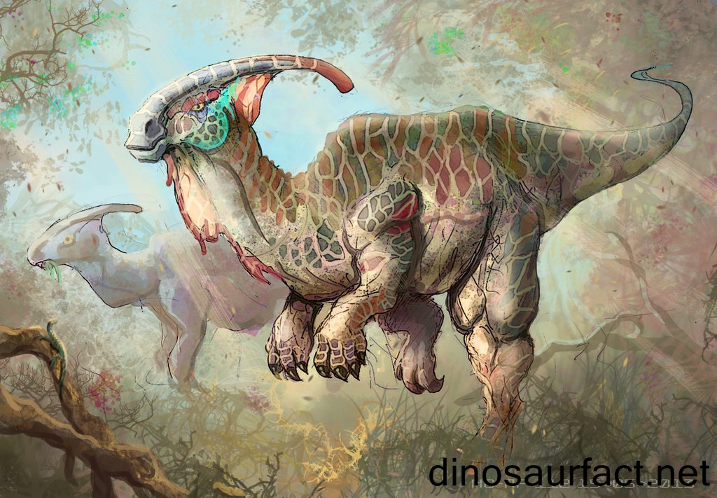
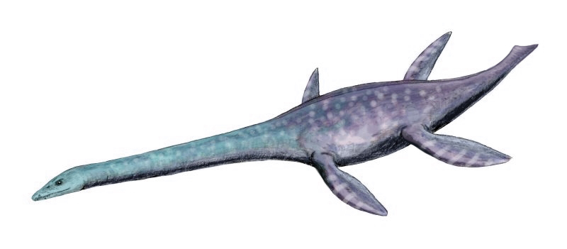
This here little blog is, today, about some dinosaur illustrations I was commissioned to create by the National Museum of Wales Cardiff. The Museum presents a sound workshop for young children about the sounds dinosaurs made, centred around the story of a nervous young Apatosaurus "Albie the Adventurer". Albie is a big scaredy-cat - afraid that all the noises in his jungle are T-Rex out to eat him up. His mother gets a little tired of this and so takes him on a journey to show him what a magical place their Jurassic jungle is. While the story is being told the children get to make all the relevant noises - the roars of the T-Rex and the trumpeting of the parasaurolophus. It sounds pretty exciting for a four-year-old!
It's safe to say that this work has been the most fun thing ever. I started by purging Canton Library of their books on prehistoric life, and studied the dinosaurs to be represented in detail, trying not to waste too much time getting drawn in to reading the books (did you know Sir David Attenborough has a pleiosaur named for him?). I then simplefied them into cartoons, retaining a realistic feel in the way they stood and moved. I drew each of the eleven parts of the story in pencil on A3 sheets, then traced over with brush and indian ink. I scanned the inkings into my mac and added all sorts of textures - fabric, bark, cardboard - and shopped in backgrounds from the Museum's own dinosaur gallery. I then added colour, and text in both Welsh and English (he's also Arwyn yr Anturiwr in case you were wondering). They have been approved without amendment, and Grace at the Museum is planning to have a t-shirt made up with one of the illustrations for when she presents the show!
Anyhow, hope you like my dinos - any feedback would be much appreciated.


It's safe to say that this work has been the most fun thing ever. I started by purging Canton Library of their books on prehistoric life, and studied the dinosaurs to be represented in detail, trying not to waste too much time getting drawn in to reading the books (did you know Sir David Attenborough has a pleiosaur named for him?). I then simplefied them into cartoons, retaining a realistic feel in the way they stood and moved. I drew each of the eleven parts of the story in pencil on A3 sheets, then traced over with brush and indian ink. I scanned the inkings into my mac and added all sorts of textures - fabric, bark, cardboard - and shopped in backgrounds from the Museum's own dinosaur gallery. I then added colour, and text in both Welsh and English (he's also Arwyn yr Anturiwr in case you were wondering). They have been approved without amendment, and Grace at the Museum is planning to have a t-shirt made up with one of the illustrations for when she presents the show!
Anyhow, hope you like my dinos - any feedback would be much appreciated.


Wednesday, 27 January 2010
There was a young man from Nantucket...
I interrupt this general work-related blog to post this, because it's funny and that. Email received this morning, and my reply:
Dear Mrs Duffy,
In the following e-mail I want to ask for your help. I am an IB student at Pangbourne College and I have the exercise to present some of your poems. I decided to work out in what way Mrs Midas is the key poem for the whole collection "the world's wife". Could you probably be so nice and help me with this exercise, because it is very important for my grades in english. I think it is very helpful if I had the opinion of the author. I hope you find time to help me.
With best wishes
Constantin D
Dear Constantin,
I am not the poet Carol Ann Duffy, but a graphic designer. And if you do manage to contact her, I think you’ll find her title, like mine, will be Ms and not Mrs.
Good luck with your studies,
Caroline
Actual LOL there at some guy asking the POET to help write his essay for him. It's very important for his grades.
Dear Mrs Duffy,
In the following e-mail I want to ask for your help. I am an IB student at Pangbourne College and I have the exercise to present some of your poems. I decided to work out in what way Mrs Midas is the key poem for the whole collection "the world's wife". Could you probably be so nice and help me with this exercise, because it is very important for my grades in english. I think it is very helpful if I had the opinion of the author. I hope you find time to help me.
With best wishes
Constantin D
Dear Constantin,
I am not the poet Carol Ann Duffy, but a graphic designer. And if you do manage to contact her, I think you’ll find her title, like mine, will be Ms and not Mrs.
Good luck with your studies,
Caroline
Actual LOL there at some guy asking the POET to help write his essay for him. It's very important for his grades.
Subscribe to:
Posts (Atom)